Adelaide Pacers

Case Study
Challenge
The brief required the creation of a journey map that explored a 20-minute route in Adelaide, presented through both editorial design and user experience. Initially, the concept of a transport-based route proved too literal and lacked creative engagement. This led to the idea of transforming the project into a more interactive and community-focused experience. The challenge became how to visually and physically communicate a journey — not just from one location to another, but as an experience that encourages participation, health, and discovery. The design needed to blend functionality, storytelling, and branding within a physical product that could engage runners of all abilities.
Goal
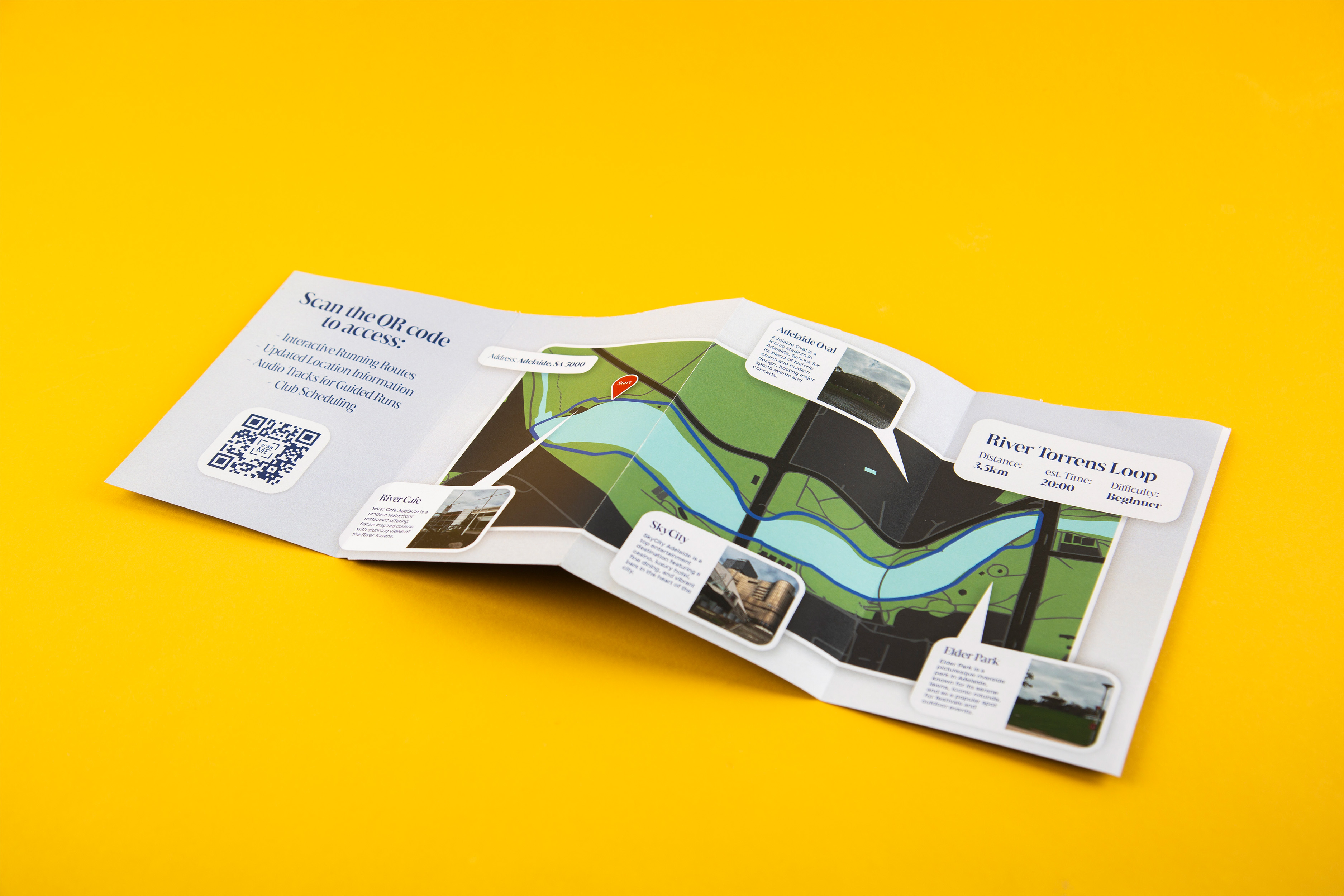
The aim was to design a cohesive brand and editorial system for a local Adelaide run club — Adelaide Pacers — centred around the scenic River Torrens Loop. The goal was to develop a 3.5 km journey that embodied inclusivity, motivation, and local pride, offering both practical navigation and a sense of community. The design would need to appeal to a wide demographic by combining professional identity, interactive features, and accessible storytelling through strong typography, colour, and layout.
Solution
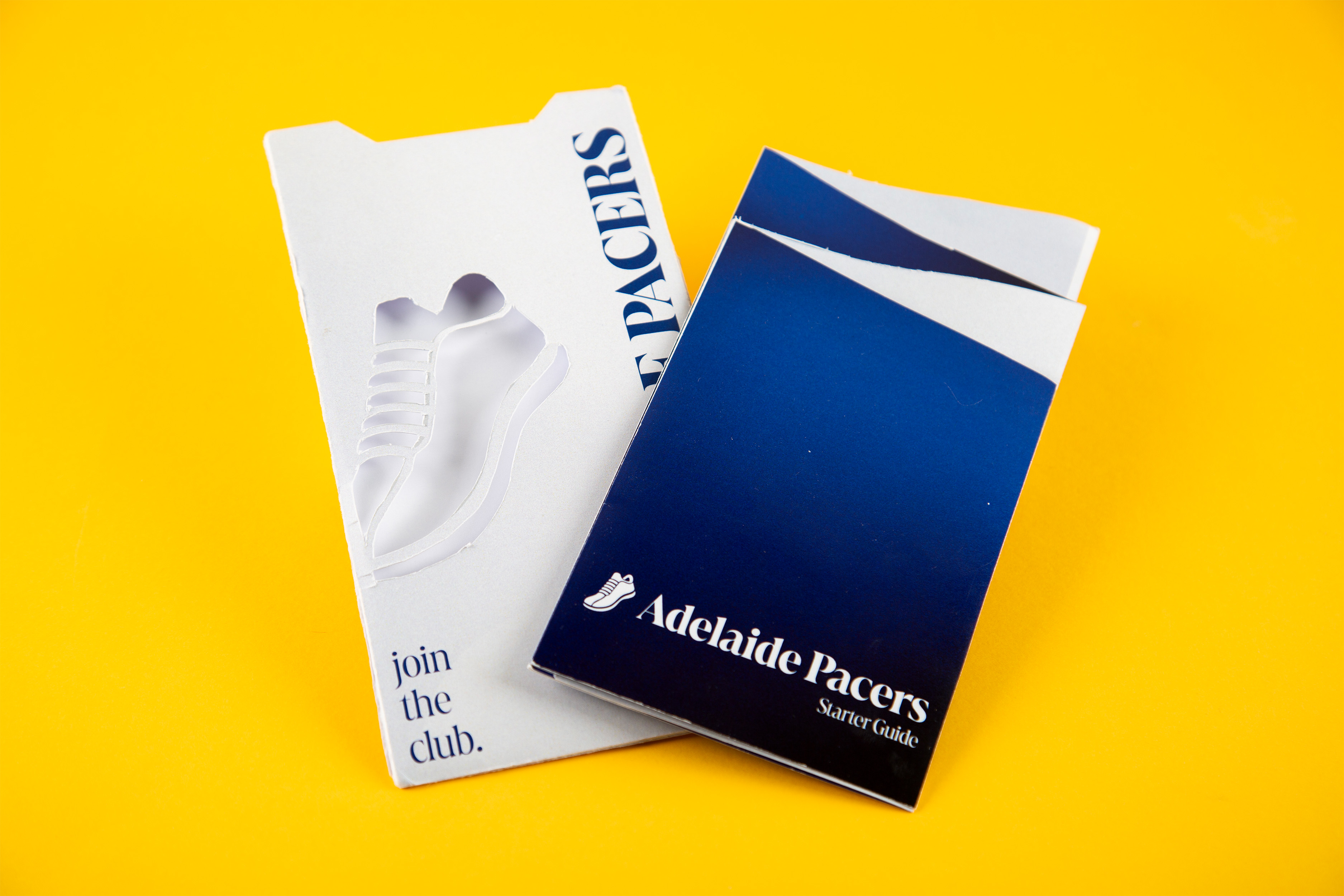
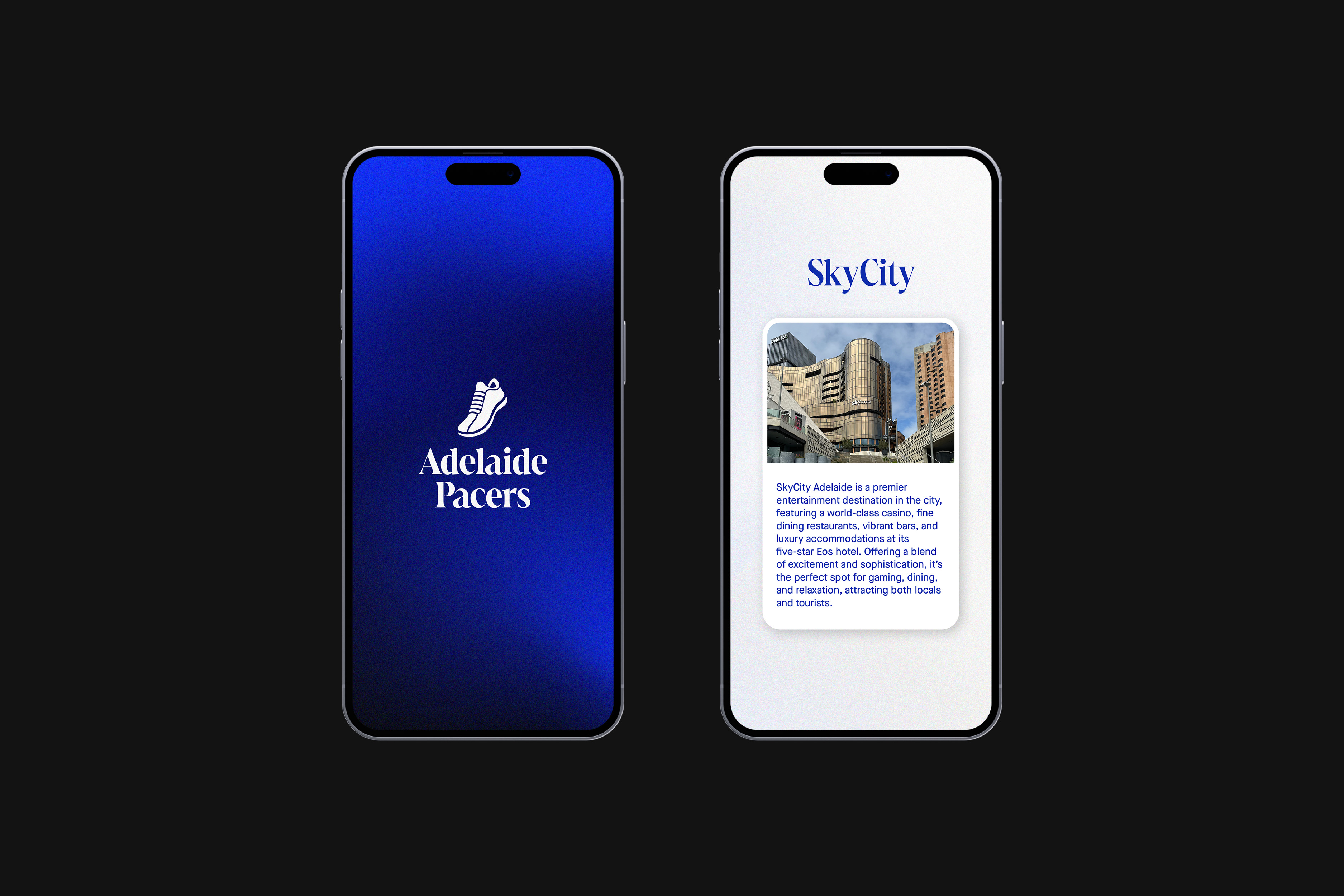
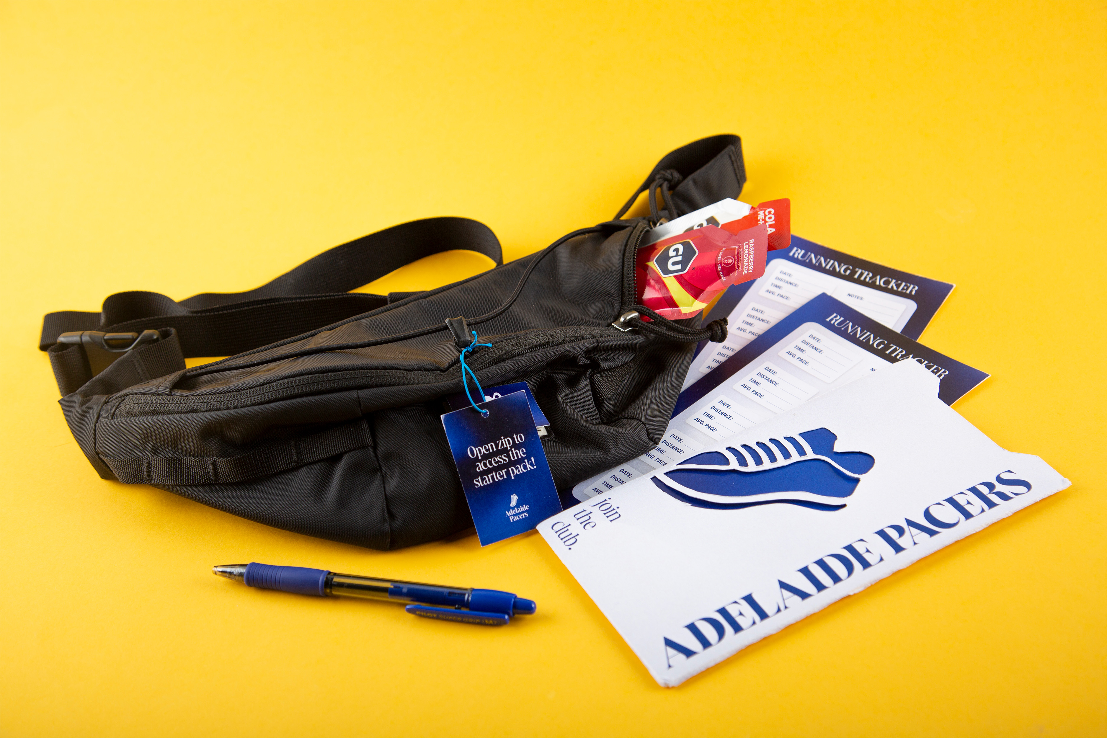
The project culminated in a branded starter kit that successfully reimagined the River Torrens Loop as a community-driven experience. The kit introduced an editorially led brochure, custom running tracker, and digital extension through a QR-linked app that provided schedules and guided audio. A vivid blue-and-white palette and a bold typographic system captured the energy and inclusivity of the club. The outcome was a tangible and digital experience that connected design, health, and place — establishing Adelaide Pacers as a vibrant brand promoting movement, community, and local identity.
GAllery