Adelaide University

Client

Adelaide University

Timeline

6 Weeks

Service

Branding
Branding · Social MEdia · Typography · Editorial Design · Motion Graphics · Video Editing · Packaging
·
Branding · Social MEdia · Typography · Editorial Design · Motion Graphics · Video Editing · Packaging
·
Branding · Social MEdia · Typography · Editorial Design · Motion Graphics · Video Editing · Packaging
·
Branding · Social MEdia · Typography · Editorial Design · Motion Graphics · Video Editing · Packaging
·
Branding · Social MEdia · Typography · Editorial Design · Motion Graphics · Video Editing · Packaging
·
Branding · Social MEdia · Typography · Editorial Design · Motion Graphics · Video Editing · Packaging
·
Branding · Social MEdia · Typography · Editorial Design · Motion Graphics · Video Editing · Packaging
·
Branding · Social MEdia · Typography · Editorial Design · Motion Graphics · Video Editing · Packaging
·
Branding · Social MEdia · Typography · Editorial Design · Motion Graphics · Video Editing · Packaging
·
Branding · Social MEdia · Typography · Editorial Design · Motion Graphics · Video Editing · Packaging
·
Branding · Social MEdia · Typography · Editorial Design · Motion Graphics · Video Editing · Packaging
·
Branding · Social MEdia · Typography · Editorial Design · Motion Graphics · Video Editing · Packaging
·
Branding · Social MEdia · Typography · Editorial Design · Motion Graphics · Video Editing · Packaging
·
Branding · Social MEdia · Typography · Editorial Design · Motion Graphics · Video Editing · Packaging
Adelaide University
Josh Davies Symbol Blue

Case Study

Josh Davies Symbol Blue

Challenge

Adelaide University was formed through the merger of two long-standing institutions — the University of Adelaide and the University of South Australia — each with distinct visual and cultural identities. The challenge lay in unifying these legacies into a single, modern brand that would feel prestigious yet approachable. The university needed to appeal to a new generation of students while maintaining the credibility, professionalism, and history of both founding institutions. A crowded higher-education landscape also demanded a visual identity that could stand apart from traditional crests and serif typography commonly associated with Australian and international universities.

Josh Davies Symbol Blue

Goal

The aim was to position Adelaide University as a collaborative, community-driven institution that fosters creativity, inclusion, and academic excellence. The rebrand sought to capture the spirit of progress — a university that not only honours its heritage but also reflects modern education’s flexibility and innovation. Targeting primarily undergraduate students aged 17–25, the design direction focused on maturity, trust, and connectedness, while conveying the brand philosophy built on collaboration and community.
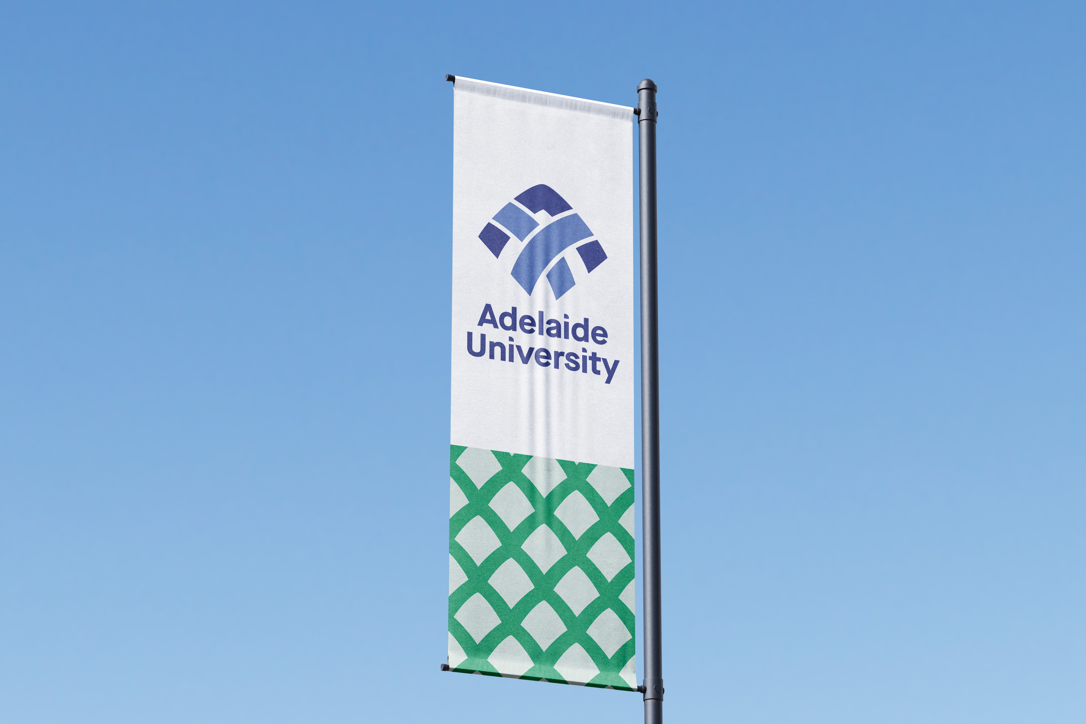
Josh Davies Symbol Blue

Solution

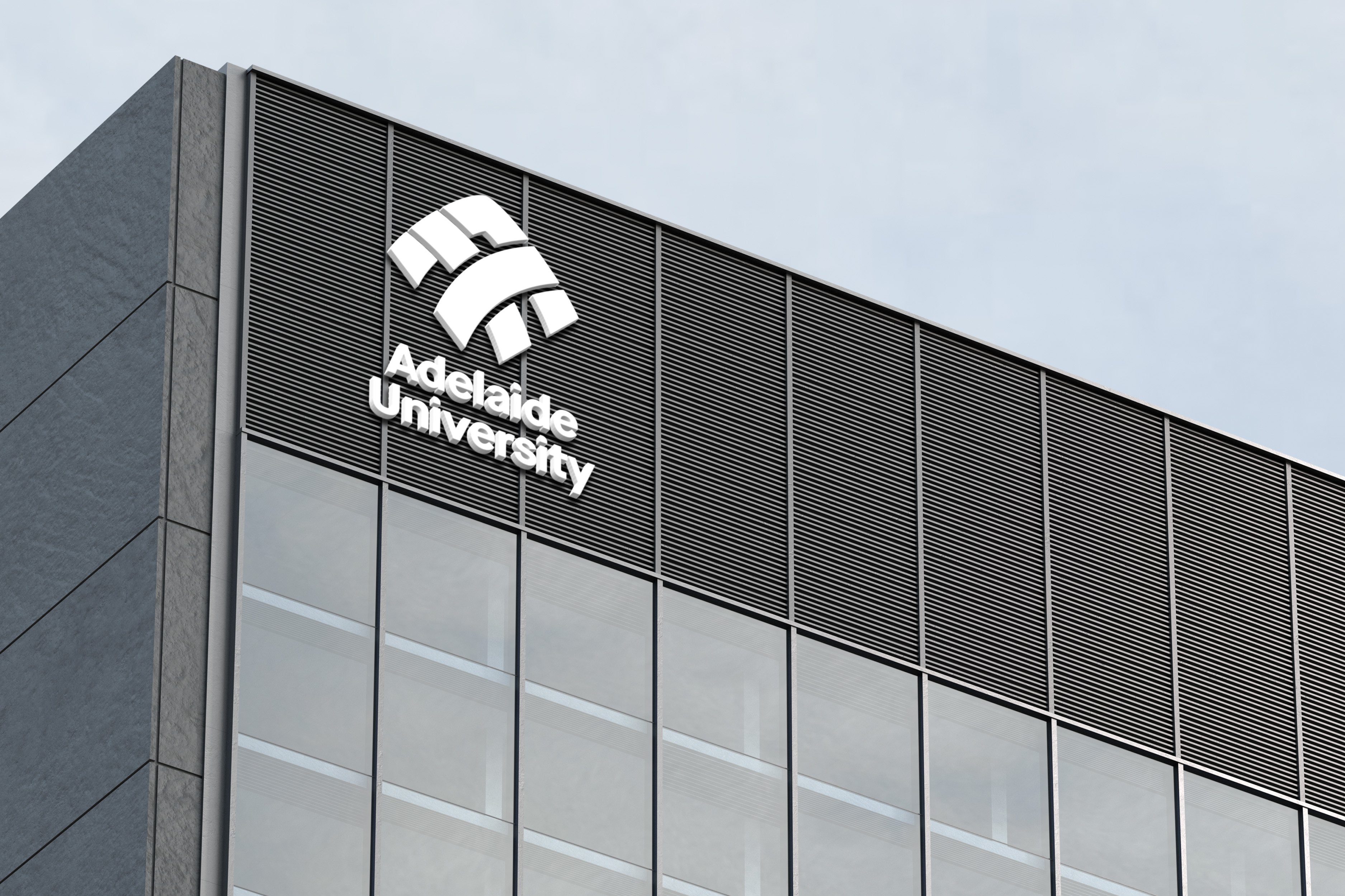
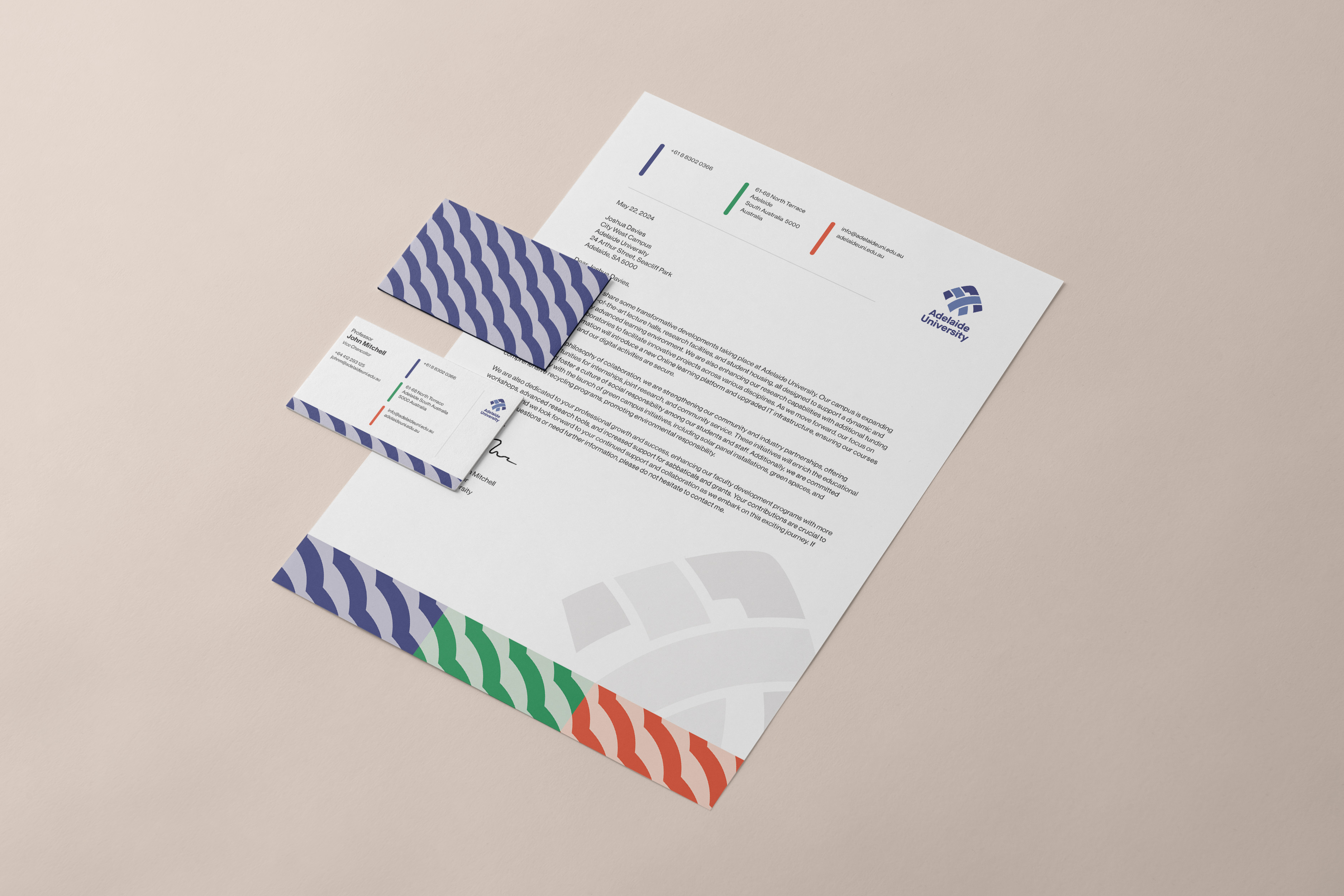
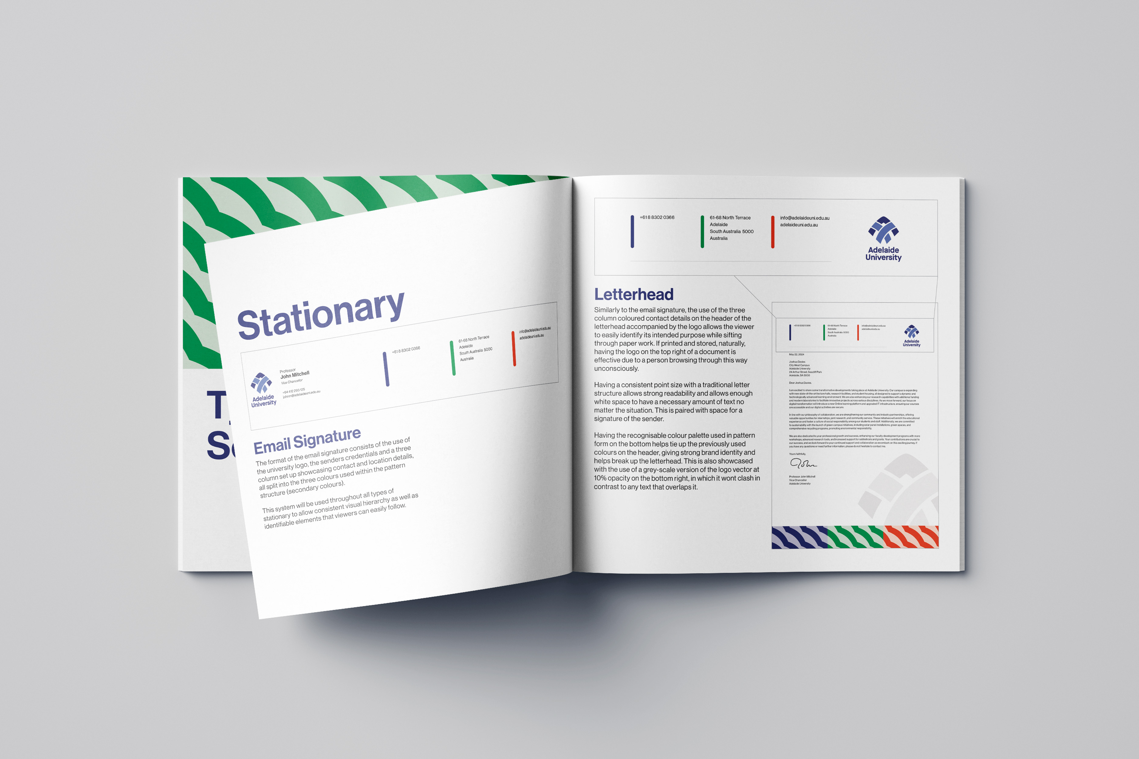
The rebrand successfully established a cohesive and contemporary identity that unified both institutions under one vision. The introduction of a ribbon-inspired logo reflected connection and momentum, symbolising the university’s evolution. A sophisticated blue palette and sans-serif typography modernised the visual system, while consistent applications across digital, environmental, and print channels reinforced credibility. The outcome was a brand that elevated Adelaide University’s presence locally and internationally — bridging heritage with innovation and resonating with a new generation of learners.

GAllery
·
GAllery
·
GAllery
·
GAllery
·

GAllery

·
GAllery
·
GAllery
·
GAllery
·
GAllery
Let's work together
·
Let's work together
·
Let's work together
·
Let's work together
·
Let's work together
·
Let's work together
·
Let's work together
·
Let's work together
·
Let's work together
·
Let's work together
·
Let's work together
·
Let's work together
·
Let's work together
·
Let's work together
Josh Davies Symbol White
Let's get
to Work.