DEZIAN

Case Study
Challenge
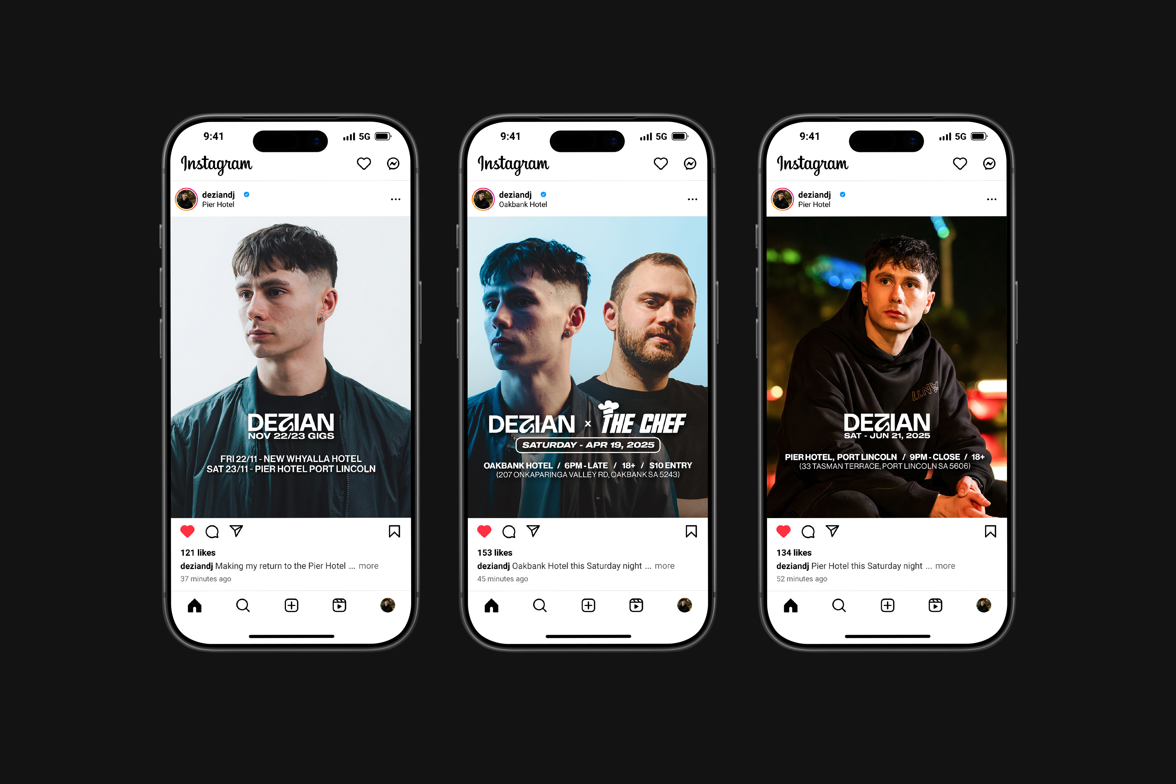
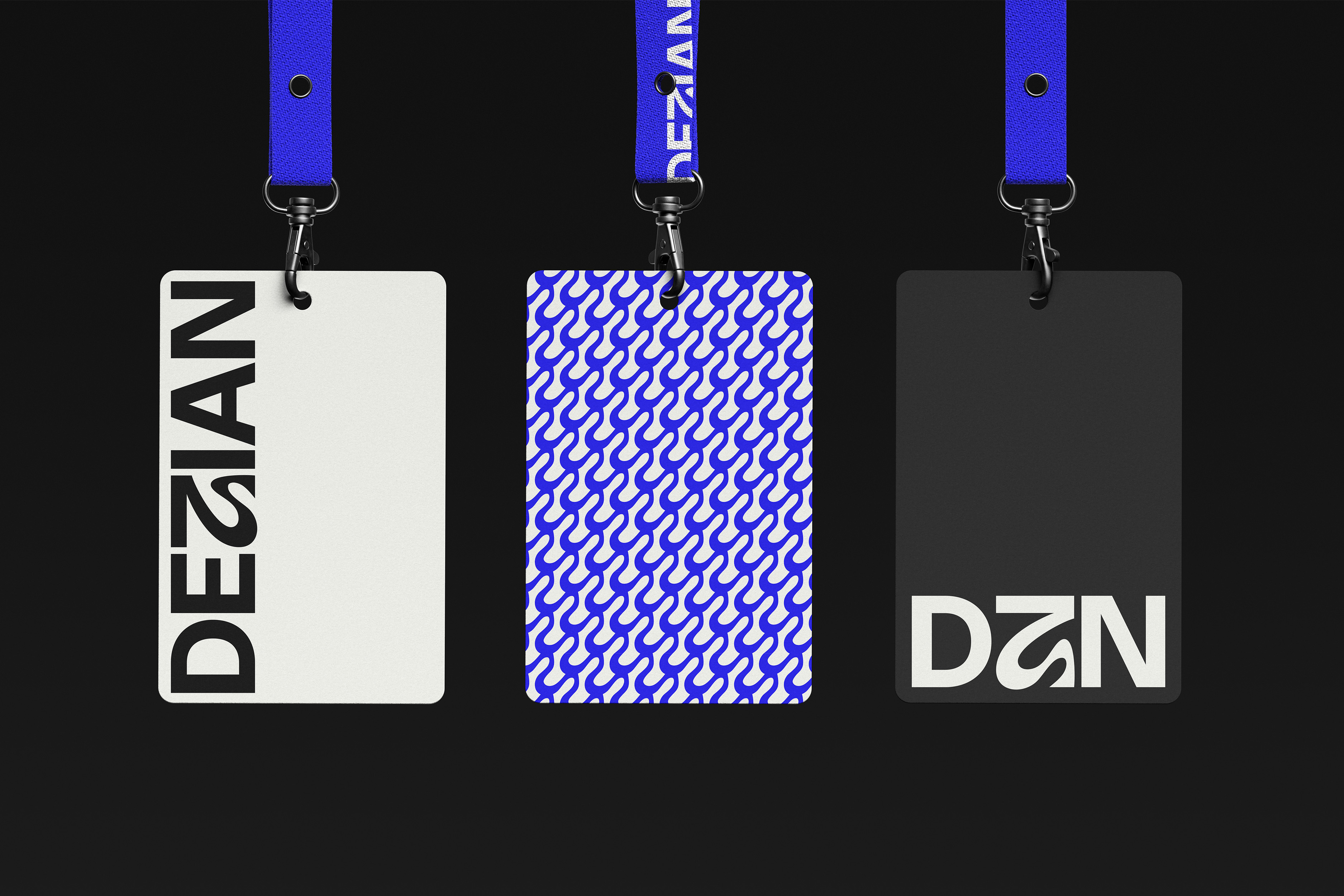
DEZIAN, a DJ based in Adelaide, South Australia, sought to establish a consistent and memorable identity that reflected the modern, dynamic culture of electronic music. Prior to the rebrand, the artist lacked a cohesive visual direction that could translate across both digital and physical platforms — from venue promotions to merchandise and live visuals. The challenge was to create a system that felt bold and contemporary, while maintaining a sense of simplicity that could adapt seamlessly across diverse applications such as lanyards and street advertisements.
Goal
The goal of the rebrand was to build a strong, versatile identity that embodied DEZIAN’s energetic performance style and professional presence within Adelaide’s growing nightlife scene. The new brand needed to capture the clean, minimal aesthetics of modern DJ culture while standing out through a unique visual element that audiences could instantly recognise. At its core, the rebrand aimed to translate sound into form — balancing rhythm, motion, and clarity through a refined typographic and graphical system.
Solution
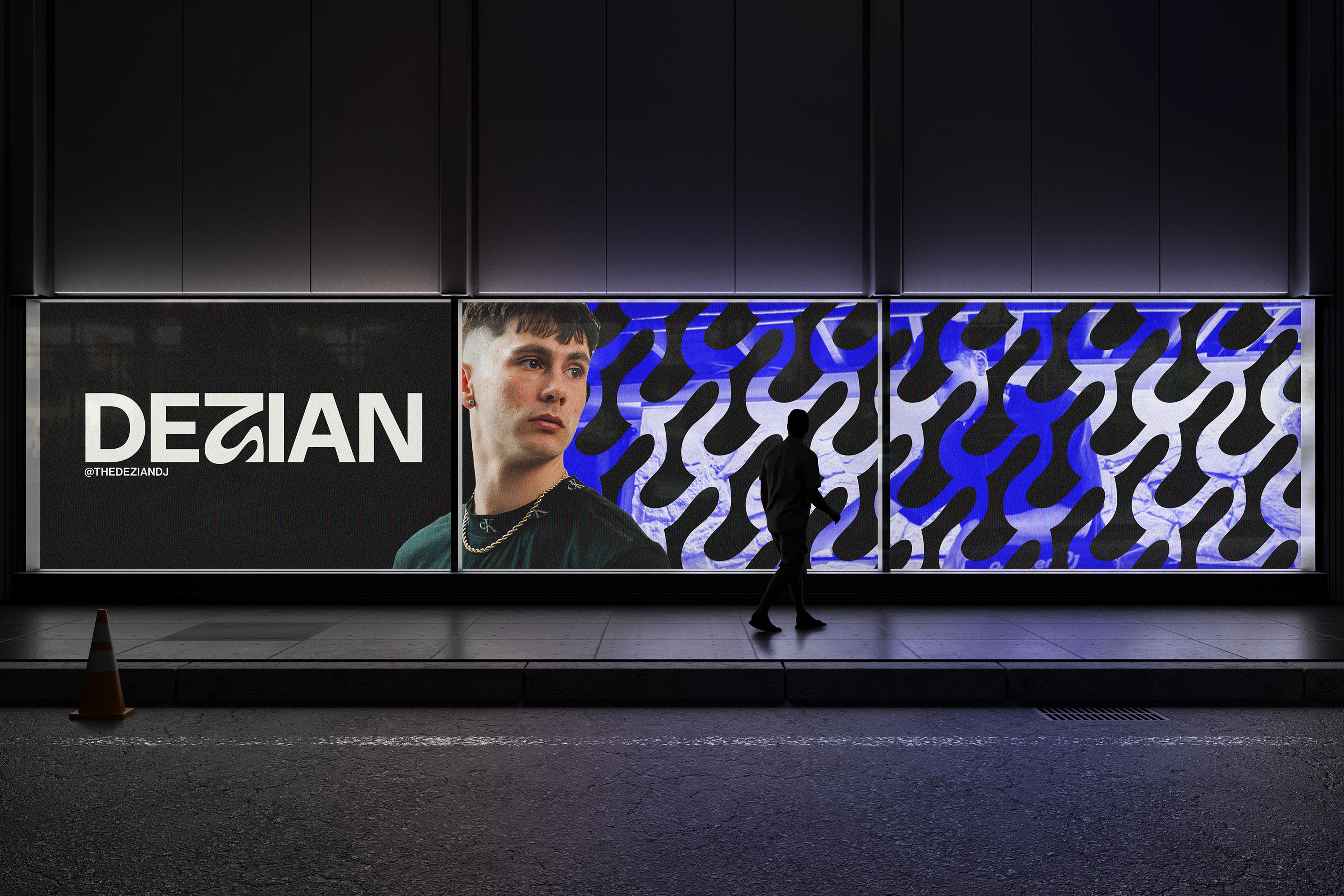
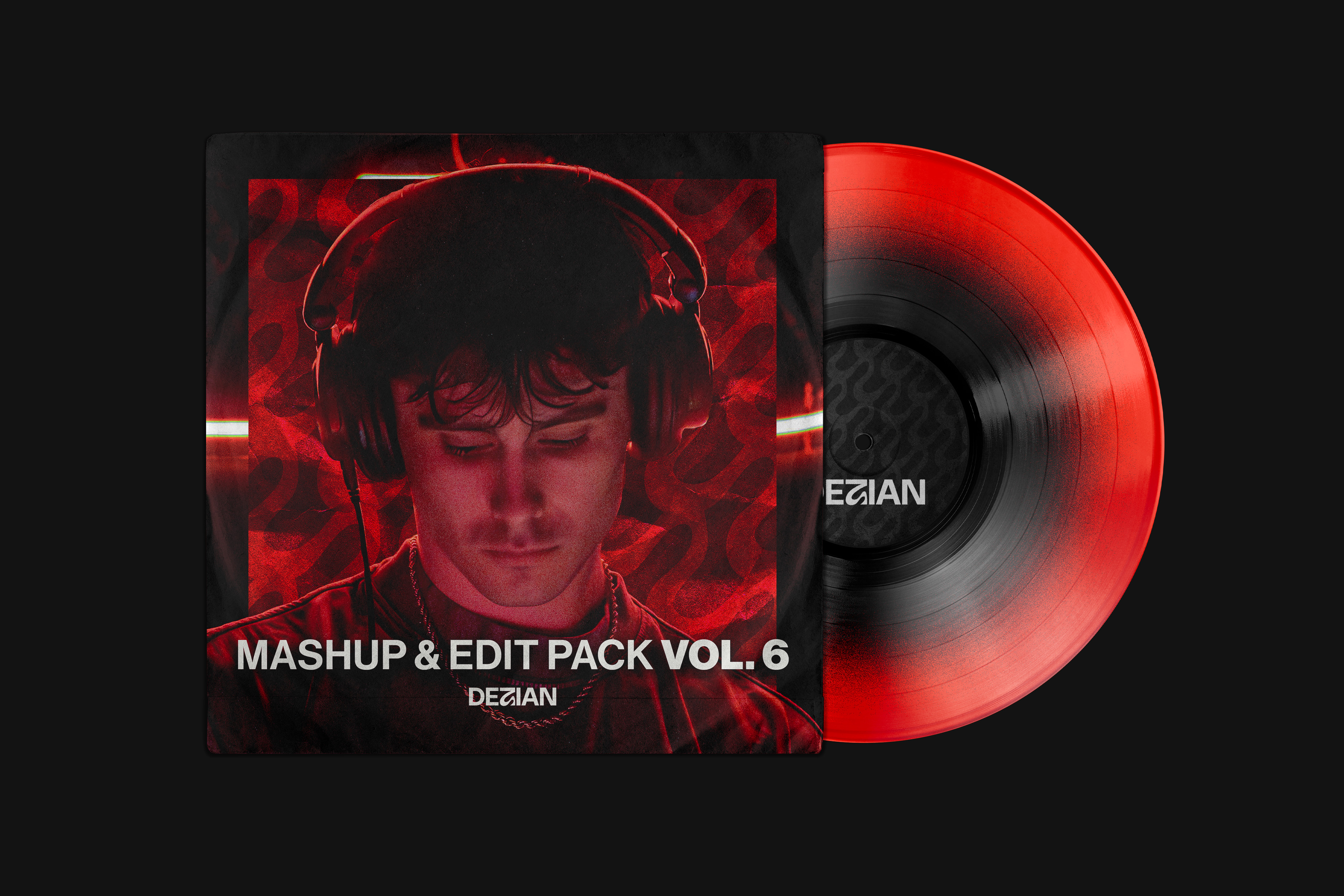
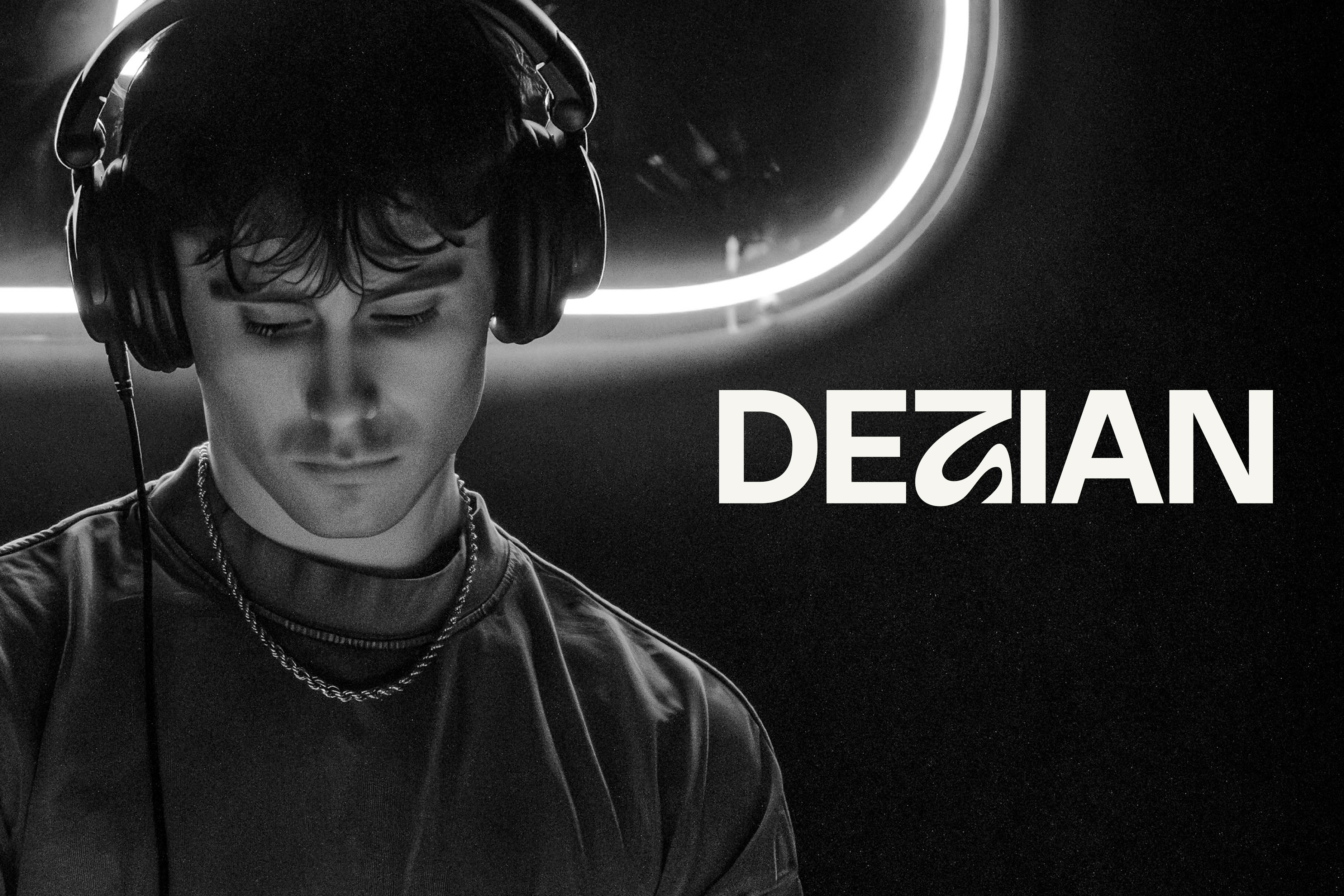
The final identity revolves around a minimalist wordmark with a distinctive ‘Z’ that acts as the brand’s signature, symbolising energy and rhythm. A sleek colour palette of Charcoal, Off-White, and Electric Blue communicates both sophistication and vibrancy, while the extended pattern — derived from the curvature of the ‘Z’ — reinforces brand cohesion across digital and venue assets. Paired with the Neue Haas Grotesk type family, the rebrand delivers a bold yet timeless presence, positioning DEZIAN as a confident and modern force within Adelaide’s electronic music culture.
GAllery