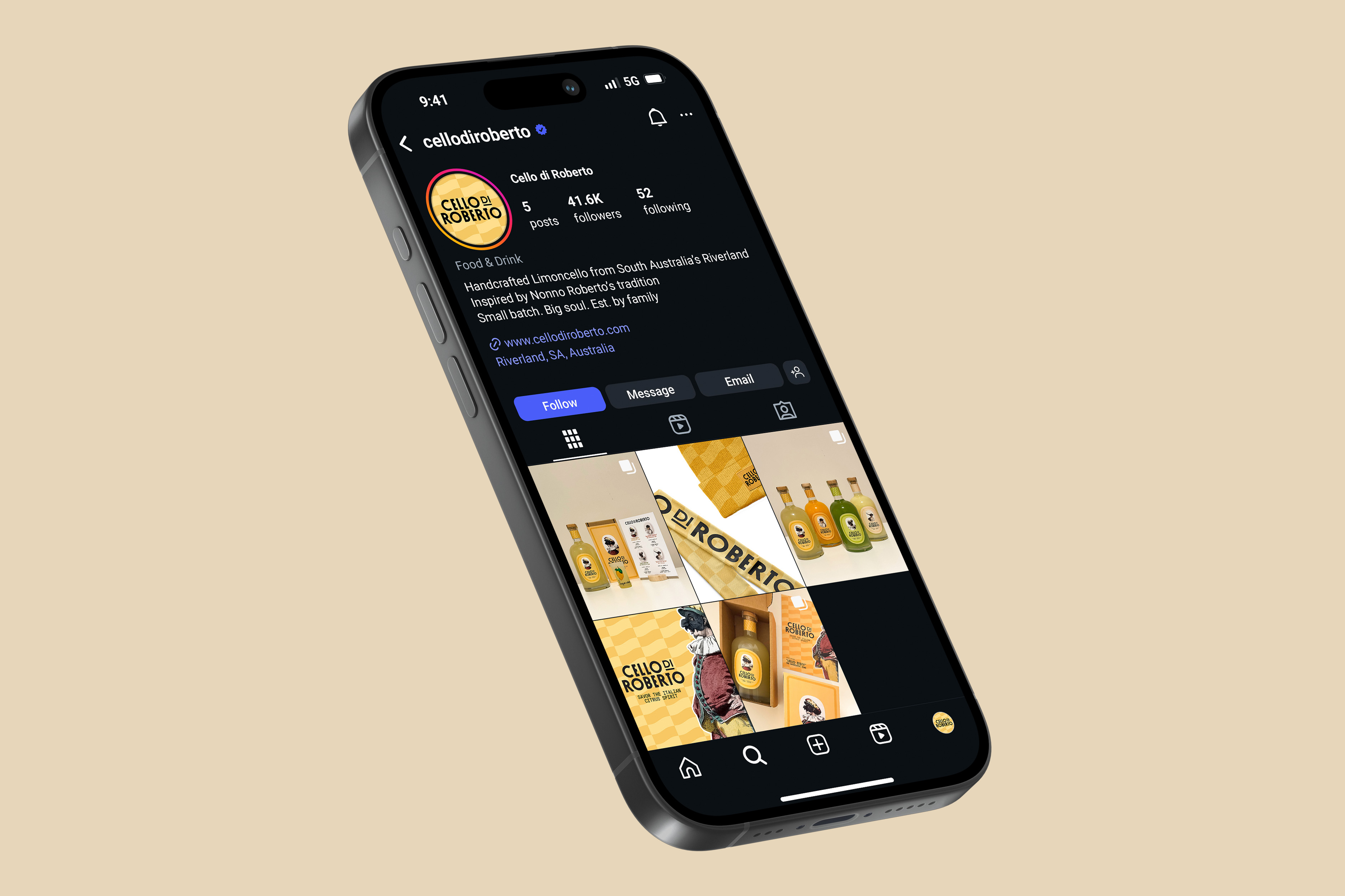
Cello di Roberto

Client

UniSA

Timeline

12 Weeks

Service

Packaging
Branding · Social MEdia · Typography · Editorial Design · Motion Graphics · Video Editing · Packaging
·
Branding · Social MEdia · Typography · Editorial Design · Motion Graphics · Video Editing · Packaging
·
Branding · Social MEdia · Typography · Editorial Design · Motion Graphics · Video Editing · Packaging
·
Branding · Social MEdia · Typography · Editorial Design · Motion Graphics · Video Editing · Packaging
·
Branding · Social MEdia · Typography · Editorial Design · Motion Graphics · Video Editing · Packaging
·
Branding · Social MEdia · Typography · Editorial Design · Motion Graphics · Video Editing · Packaging
·
Branding · Social MEdia · Typography · Editorial Design · Motion Graphics · Video Editing · Packaging
·
Branding · Social MEdia · Typography · Editorial Design · Motion Graphics · Video Editing · Packaging
·
Branding · Social MEdia · Typography · Editorial Design · Motion Graphics · Video Editing · Packaging
·
Branding · Social MEdia · Typography · Editorial Design · Motion Graphics · Video Editing · Packaging
·
Branding · Social MEdia · Typography · Editorial Design · Motion Graphics · Video Editing · Packaging
·
Branding · Social MEdia · Typography · Editorial Design · Motion Graphics · Video Editing · Packaging
·
Branding · Social MEdia · Typography · Editorial Design · Motion Graphics · Video Editing · Packaging
·
Branding · Social MEdia · Typography · Editorial Design · Motion Graphics · Video Editing · Packaging
Cello di Roberto
Josh Davies Symbol Blue

Case Study

Josh Davies Symbol Blue

Challenge

Cello di Roberto is a family-run business based in the heart of South Australia’s Riverland, an area renowned for its ideal brewing climate. Inspired by the traditions of the late Roberto Rea, the brand celebrates a deep Italian heritage rooted in Naples. While limoncello has long been a symbol of Italian culture, there remains a significant gap in the Australian market, with only a few competitors such as Zincello. This presented a unique challenge: to introduce authentic, high-quality limoncello to a market unfamiliar with its tradition, while ensuring the story of family, culture, and craftsmanship remains central to the brand’s identity.

Josh Davies Symbol Blue

Goal

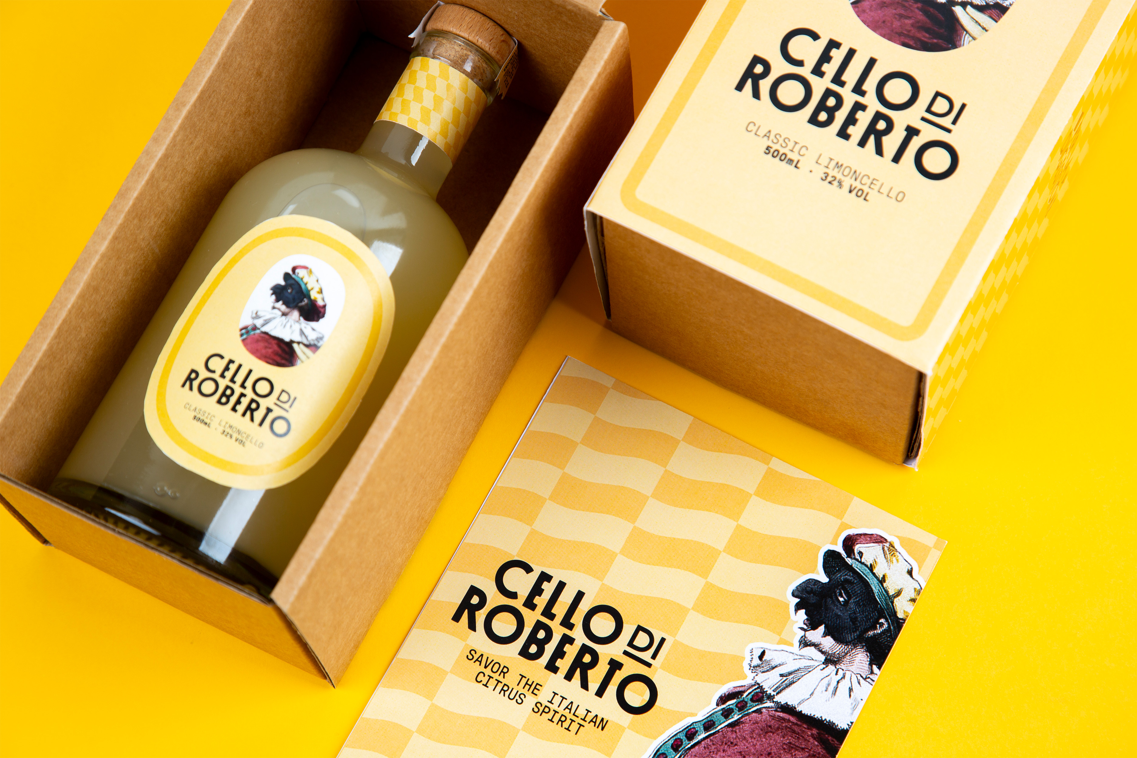
The aim was to create a brand that not only honours Roberto Rea’s Neapolitan legacy but also reimagines limoncello as a lifestyle product for a new generation of Australians. Targeting 25–32-year-olds with a refined taste for spirits, ‘Cello di Roberto’ seeks to balance authenticity with contemporary appeal. The intention was to craft a product priced at $60 AUD per 500mL bottle that feels premium yet accessible — something to be shared and celebrated, particularly in social and summer settings.

Josh Davies Symbol Blue

Solution

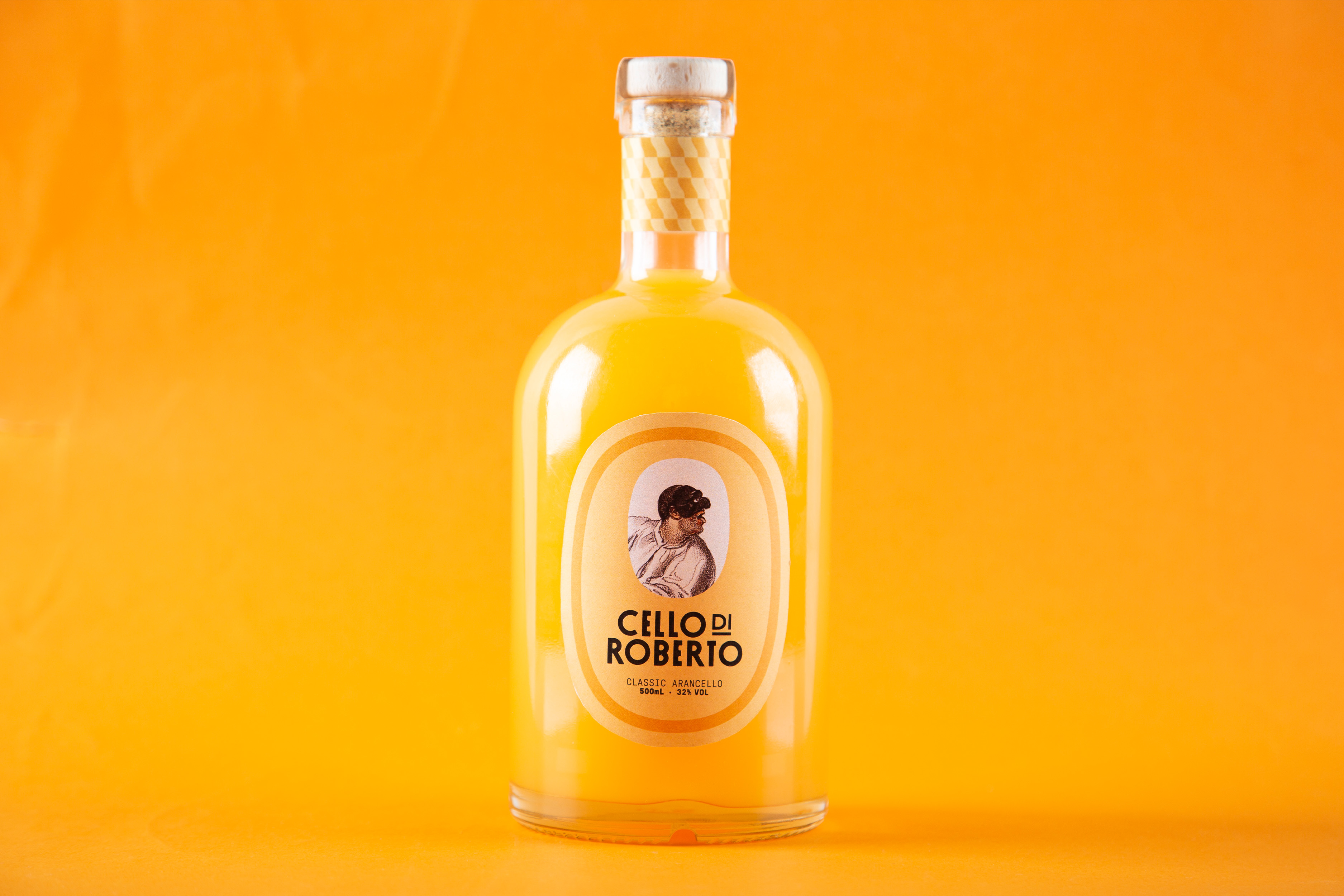
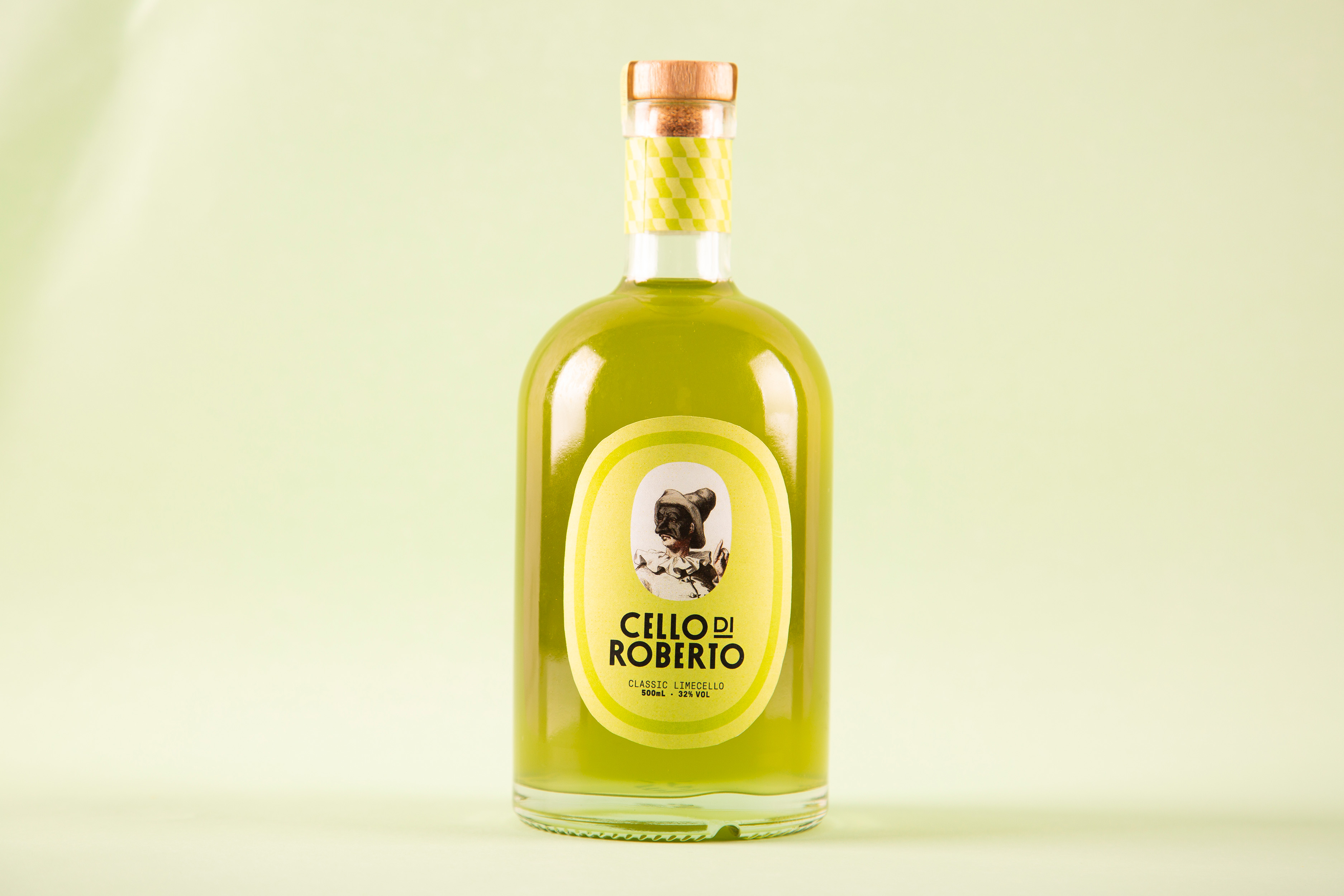
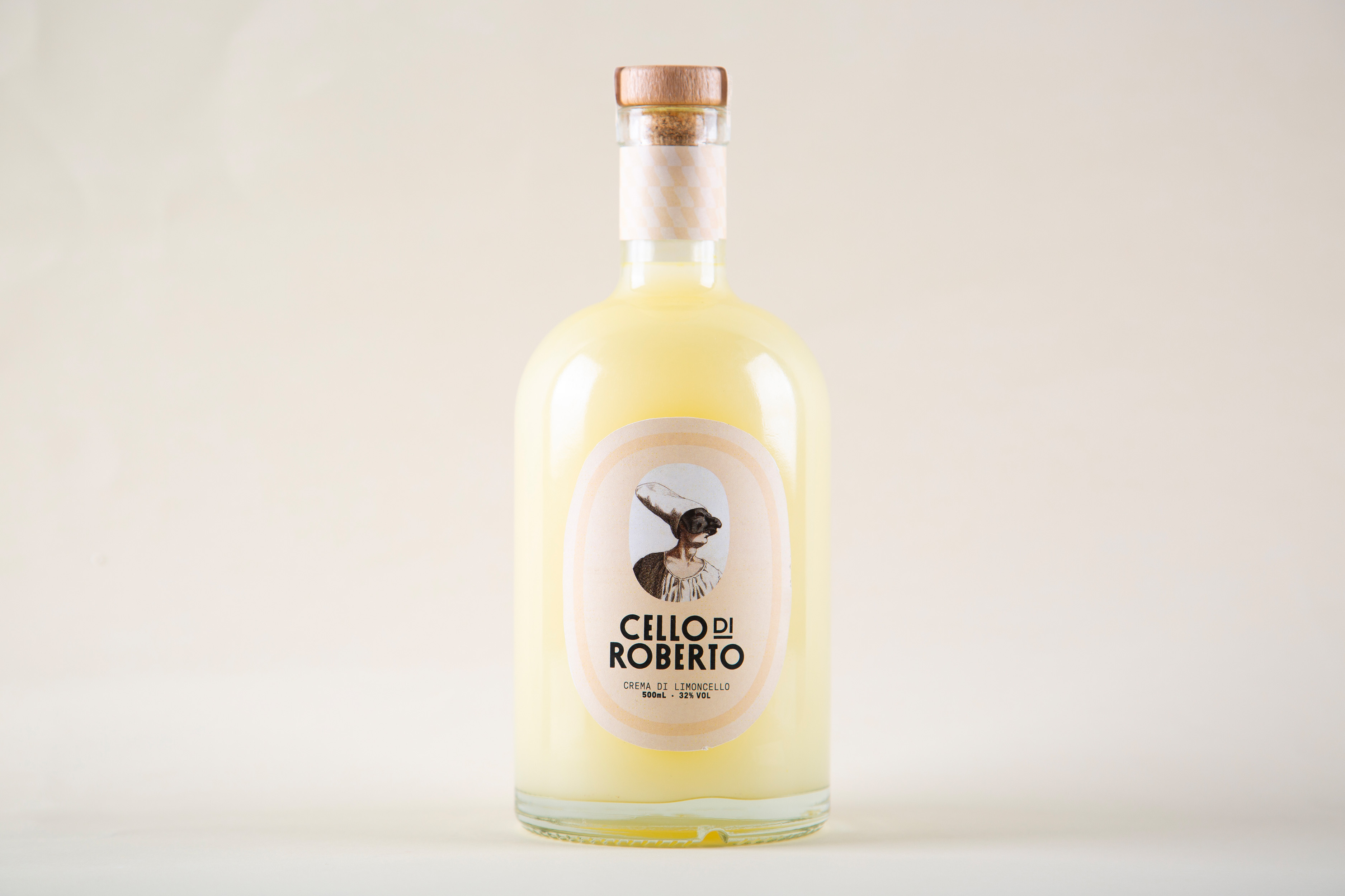
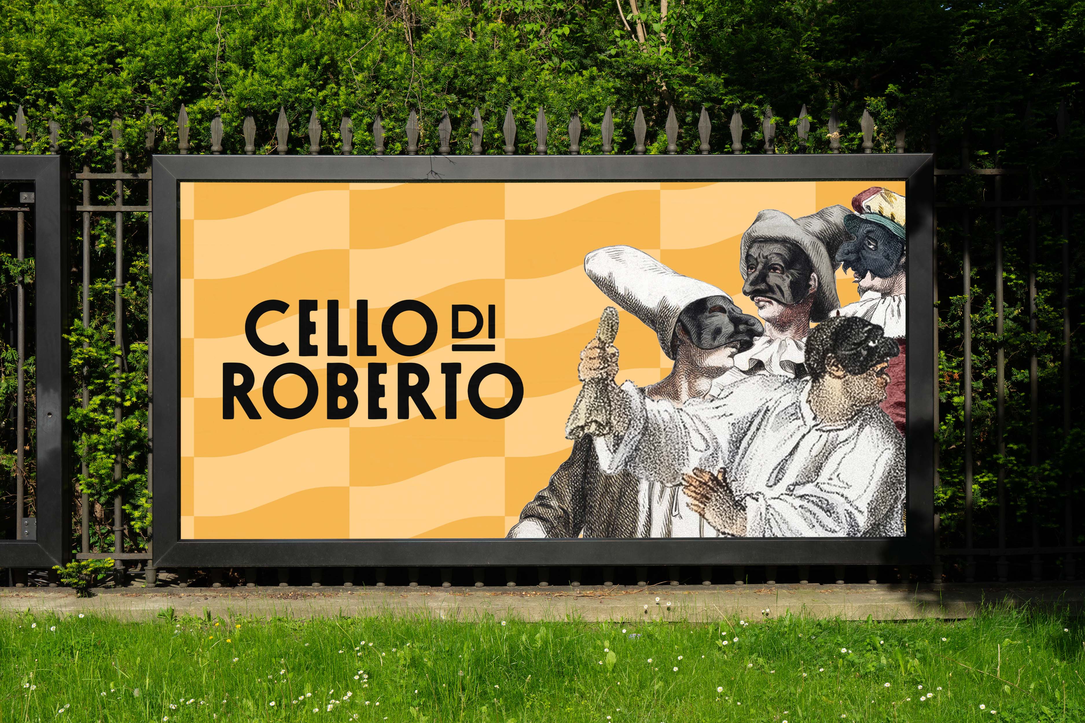
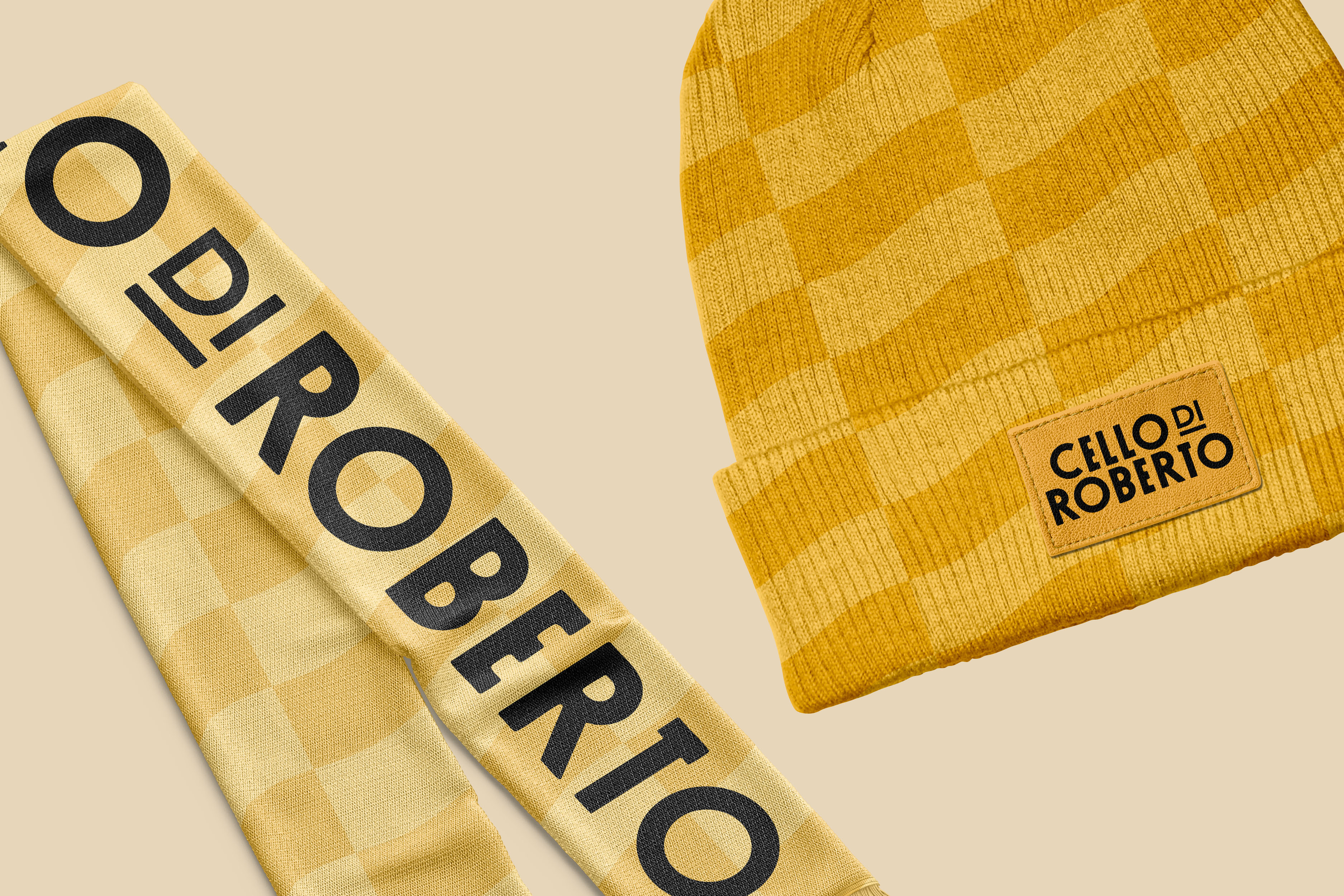
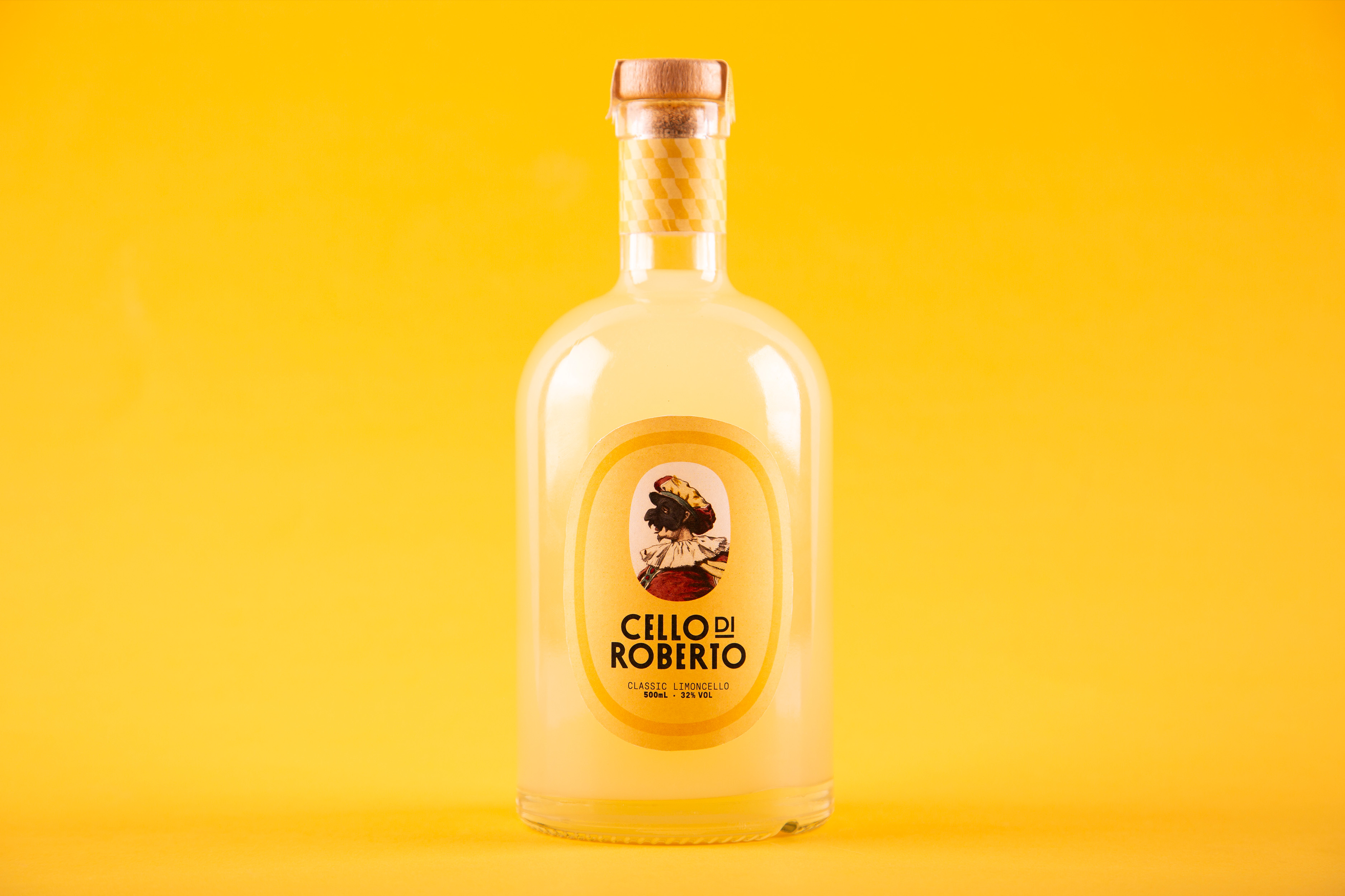
Through extensive research into Napoli’s cultural heritage and limoncello’s historical significance, the brand was developed around four signature flavours — limoncello, arancello, limecello, and crema di limoncello — each personified by Pulcinella-inspired characters representing aspects of Roberto’s personality. Using soft shapes, flat colour palettes, and traditional typography, the packaging and design embody warmth, family, and connection, positioning ‘Cello di Roberto’ as a heartfelt blend of Italian tradition and Australian lifestyle.

GAllery
·
GAllery
·
GAllery
·
GAllery
·

GAllery

·
GAllery
·
GAllery
·
GAllery
·
GAllery
Let's work together
·
Let's work together
·
Let's work together
·
Let's work together
·
Let's work together
·
Let's work together
·
Let's work together
·
Let's work together
·
Let's work together
·
Let's work together
·
Let's work together
·
Let's work together
·
Let's work together
·
Let's work together
Josh Davies Symbol White
Let's get
to Work.