Swish Bets


Case Study
Challenge
Swish Bets, a sports-betting brand focused primarily on the NBA and NBL, required a consistent and data-driven visual identity that could keep pace with the high-energy nature of professional basketball. As an ongoing client, the challenge was to maintain brand cohesion across a large volume of recurring content — including season recaps, pricing announcements, giveaways, and statistical updates — while ensuring each post remained fresh, engaging, and instantly recognisable. The fast turnaround of sports results and constant visual competition on social media demanded designs that were both dynamic and dependable, blending entertainment with credibility across every graphic.
Goal
The primary goal was to evolve Swish Bets’ visual communication into a recognisable brand language that merges analytics, excitement, and trust. The aim was to convey statistical accuracy and performance success through powerful visuals — combining the thrill of sport with data transparency. Each design needed to align with the tone of professional sports media while maintaining accessibility for Swish Bets’ online audience. Over time, the objective extended to developing an adaptable design framework that could handle seasonal content — from All-Star Break updates to Finals recaps — without losing brand consistency.
Solution
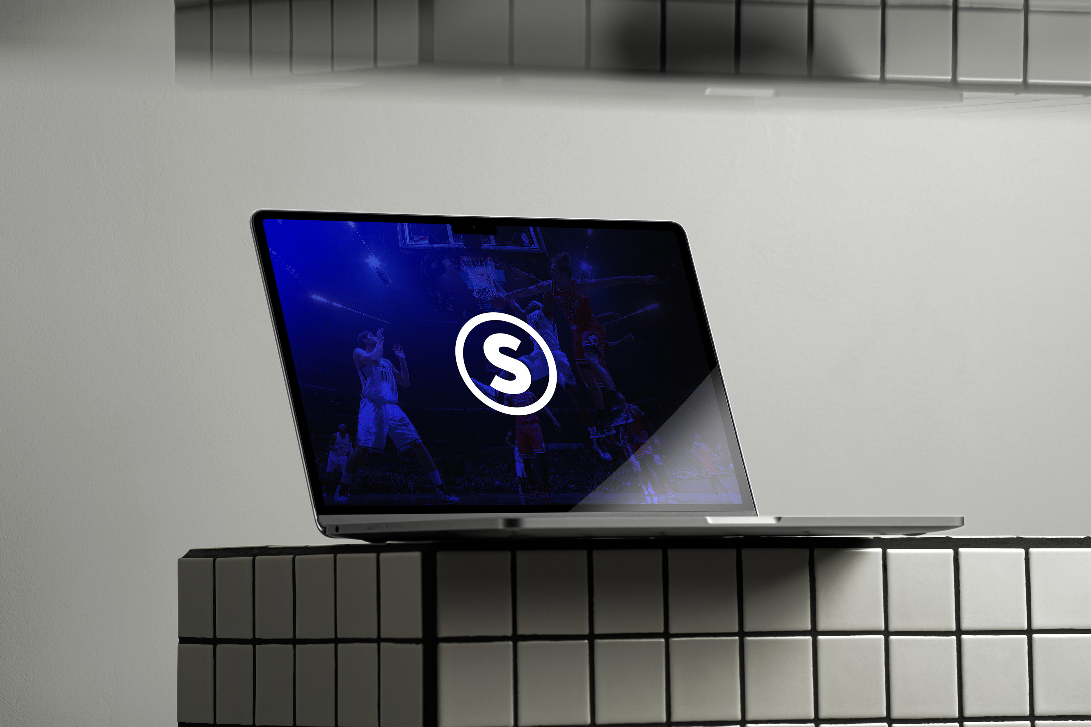
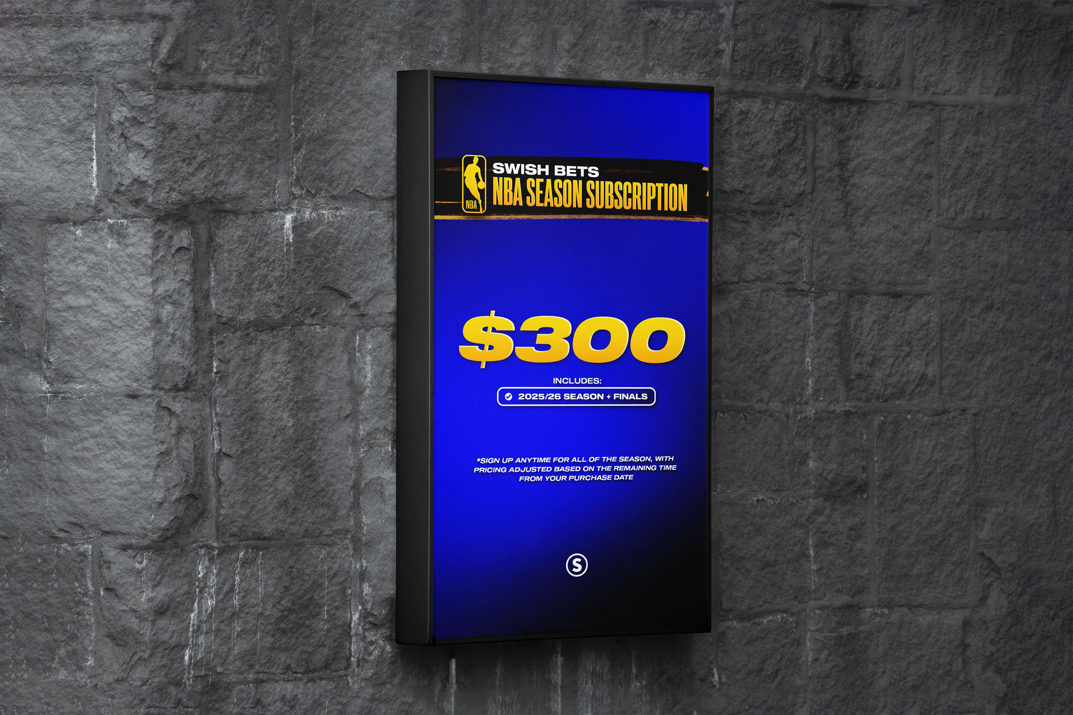
A refined system was built around bold typography, high-contrast colour palettes (gold, blue, black), and structured data blocks that highlight betting performance. Graphical elements such as progress charts, ROI trackers, and award recaps were integrated with player photography and NBA iconography to reinforce legitimacy and excitement. The recurring use of gold brush strokes and the Swish “S” emblem ensured brand recognition, while the modular layout system allowed for scalable design production across ongoing seasons. The result is a professional, energetic visual identity that reflects Swish Bets’ growing authority in the sports analytics space.
GAllery


